LATEST PROJECTS


Project | 01
Project | 01 Ice Cream Fundae
I wanted to do fun pastel colors for part of my design to make my packaging more vibrant and more interesting. I wanted my packaging to be more appealing so I went with pastel colors because most people are drawn to it. I also wanted something fun to look at not just a normal ice cream brand. I wanted it to stand out in stores.


Project | 02
Project | 02 Brochure Project
Laura Pol was my influence on this project. She would take geometric shapes and incorporate them into her work. She would sometimes have bright colors and other times she would have just black and white so I chose to go wither bright colors for my works.


Project | 03
Project | 03 DESmag
I wanted a little variation in my magazine title. That is why I went with capital letters for the first 3 letters and lower case letters for the last 3. Keeps it interesting. I chose these three colors for the cover because each one of these colors are in each of the articles. I went through so many fonts to find the one I liked and the one I picked is called The Queen and the serif font goes well with the name of the magazine.


Project | 04
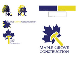
Project | 04 Maple Grove Construction
Instead of using the maze and blue logo for the stationary, I used the blue and white mostly because it’s more powerful and more visually appealing. The hammer shows that this is a construction company and the maple leaf shows what the company is named after the township where it is located which is Maple grove is a township in Michigan.
Project | 04
Project | 05 C-Tech Solutions